
The Midnight Archives
Month/Year: August, 2026
Industry: Publishing & Literature
Project Overview
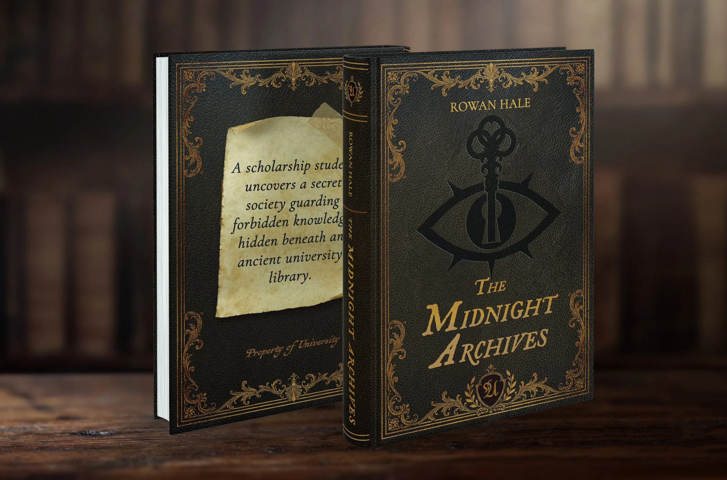
The Midnight Archives is a cover design for a dark academia mystery. It was originally intended as a mock project; however, the design may now be available for purchase.
“A scholarship student uncovers a secret society guarding forbidden knowledge hidden beneath an ancient university library” is the basic premise behind The Midnight Archives. I wanted this cover to feel as if it were exclusive to the world of the story: old and mysterious, while still fitting an academic style and atmosphere.
While I already had one idea in mind, I wanted to explore three different concepts, each uniquely interpreting the story, but all having one thing in common: the secret society.
The first concept is an old leather-bound tome that looks like it was taken straight from the secret society’s archives. The second is a hallway within the hidden archives, dark and dusty, with a hint of something sinister happening in the background. The third is a workspace within the hidden archive, with papers and scrolls showing important story details, such as architecture.
Design Process
Mood Boards & Exploration
I started this project as I do with each project I create: mood boards. I gathered visual references for each concept.
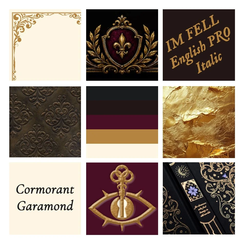
For Concept 1, I was after images, patterns and textures that felt luxurious and ornate, but still old and worn. I looked for things like old embossed leather, ornated detailing and gold foil.
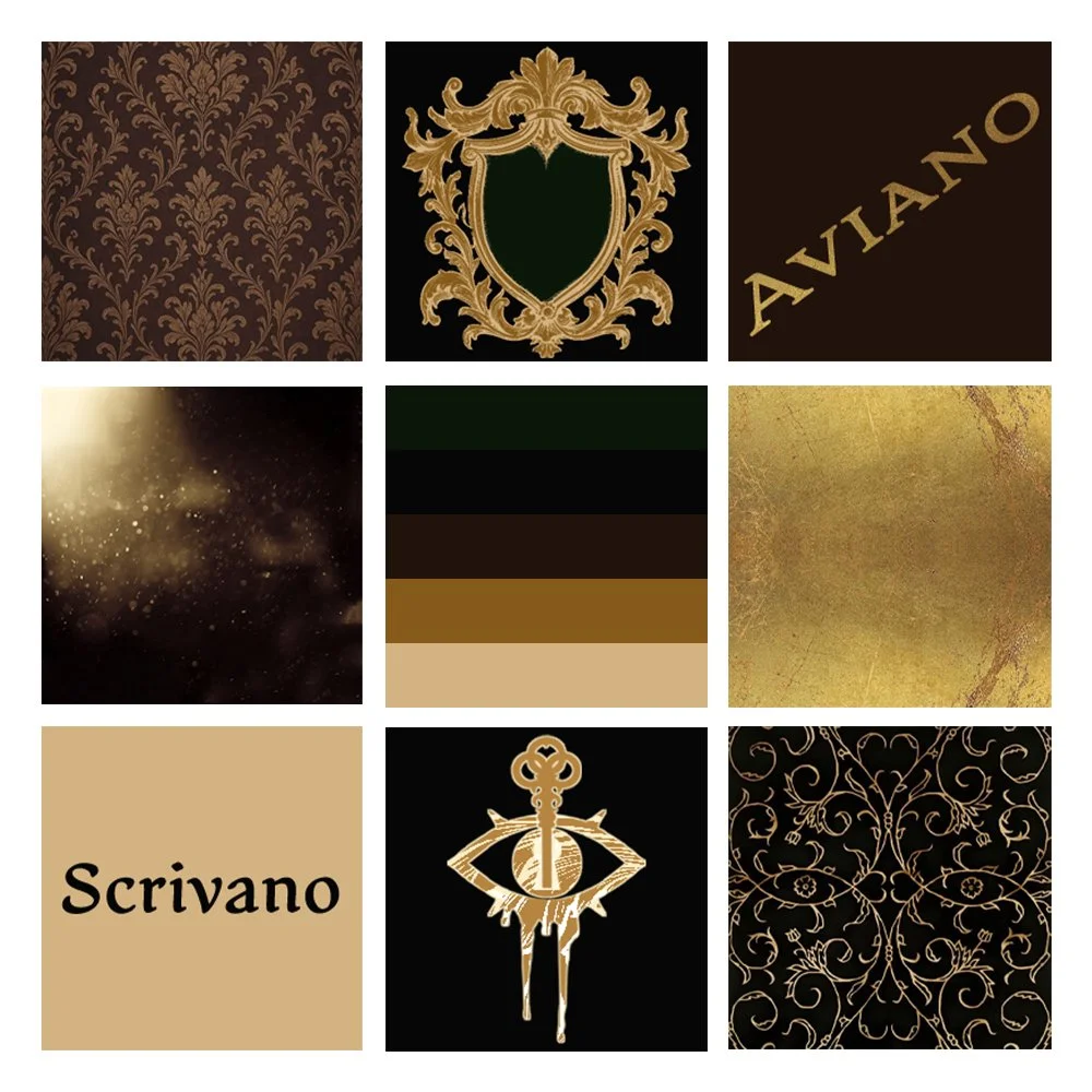
For Concept 2, I searched for images that felt exclusive, but almost forgotten for good reason: dark, luxurious and ornate patterns, dust motes, and dripping blood.
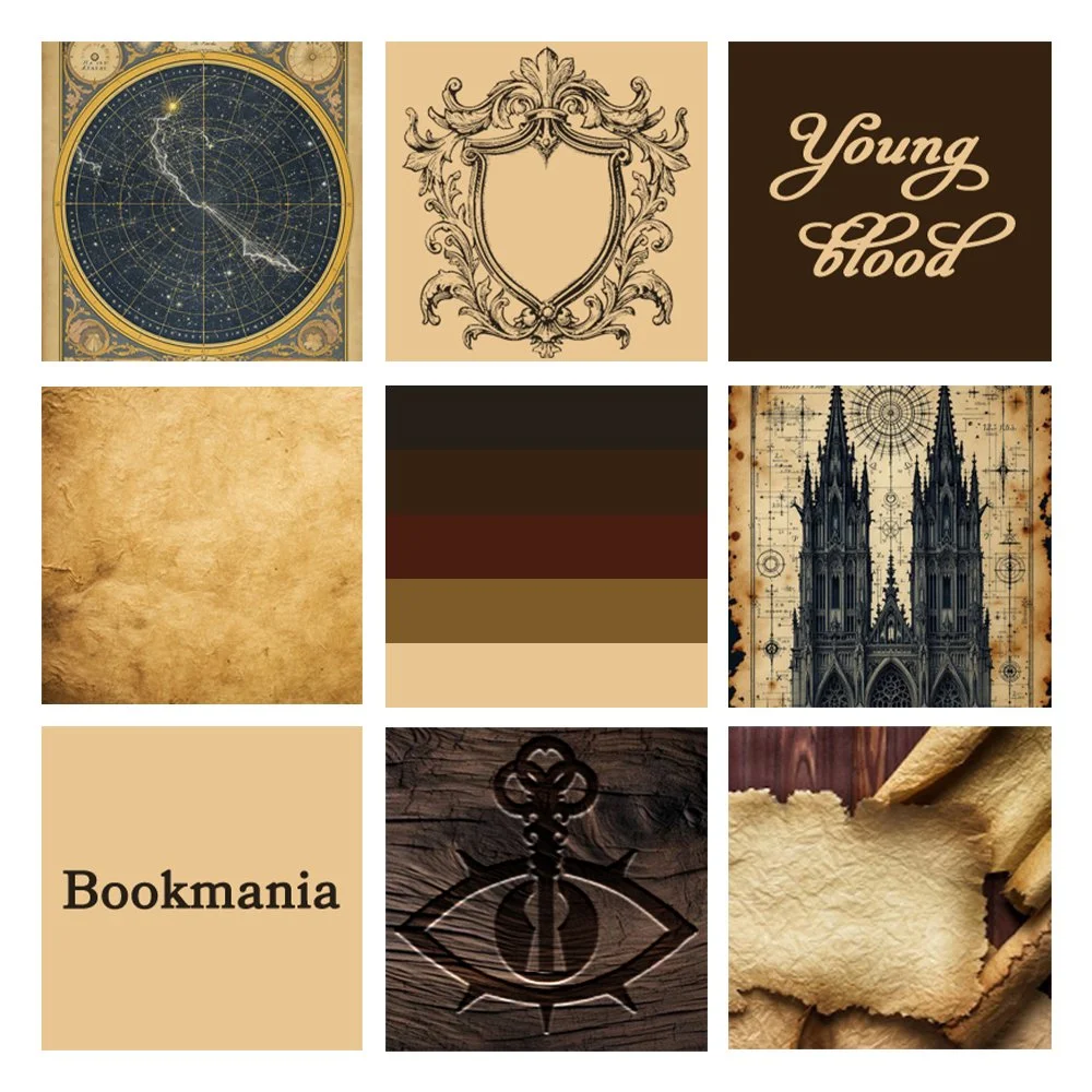
For Concept 3, I was after textures and potential imagery that could be seen on the workspace: engraved wood, parchment paper, and star maps.
Concept 1
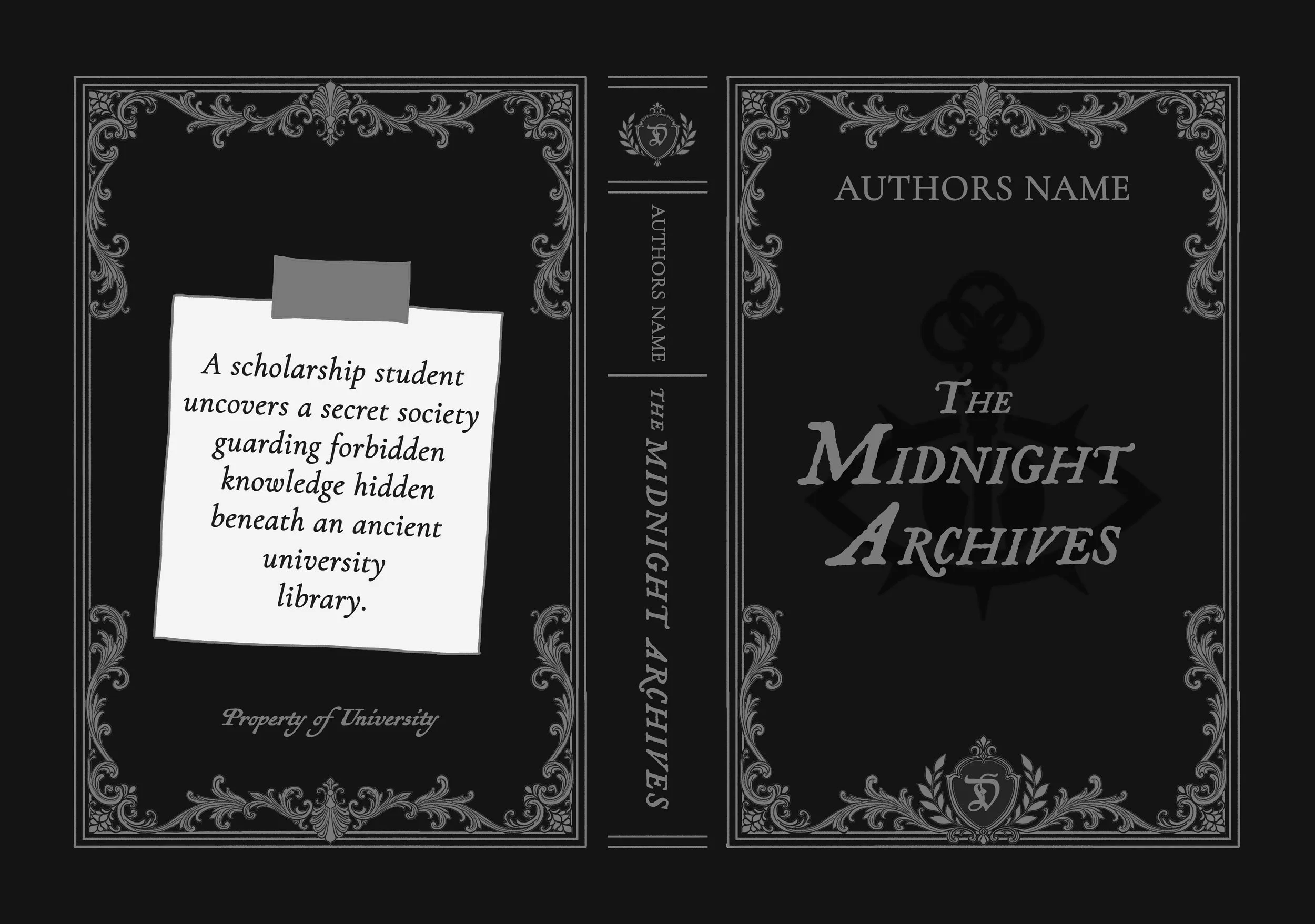
I imagined the book as an actual tome that belonged to a collection within the secret society’s archives. The leather binding, ornate border and gold detailing were meant to make it feel like an old, valuable book that had been kept within the university for generations. Someone had then snuck it out of the archives, so the reader could know the truth.
Concept 2
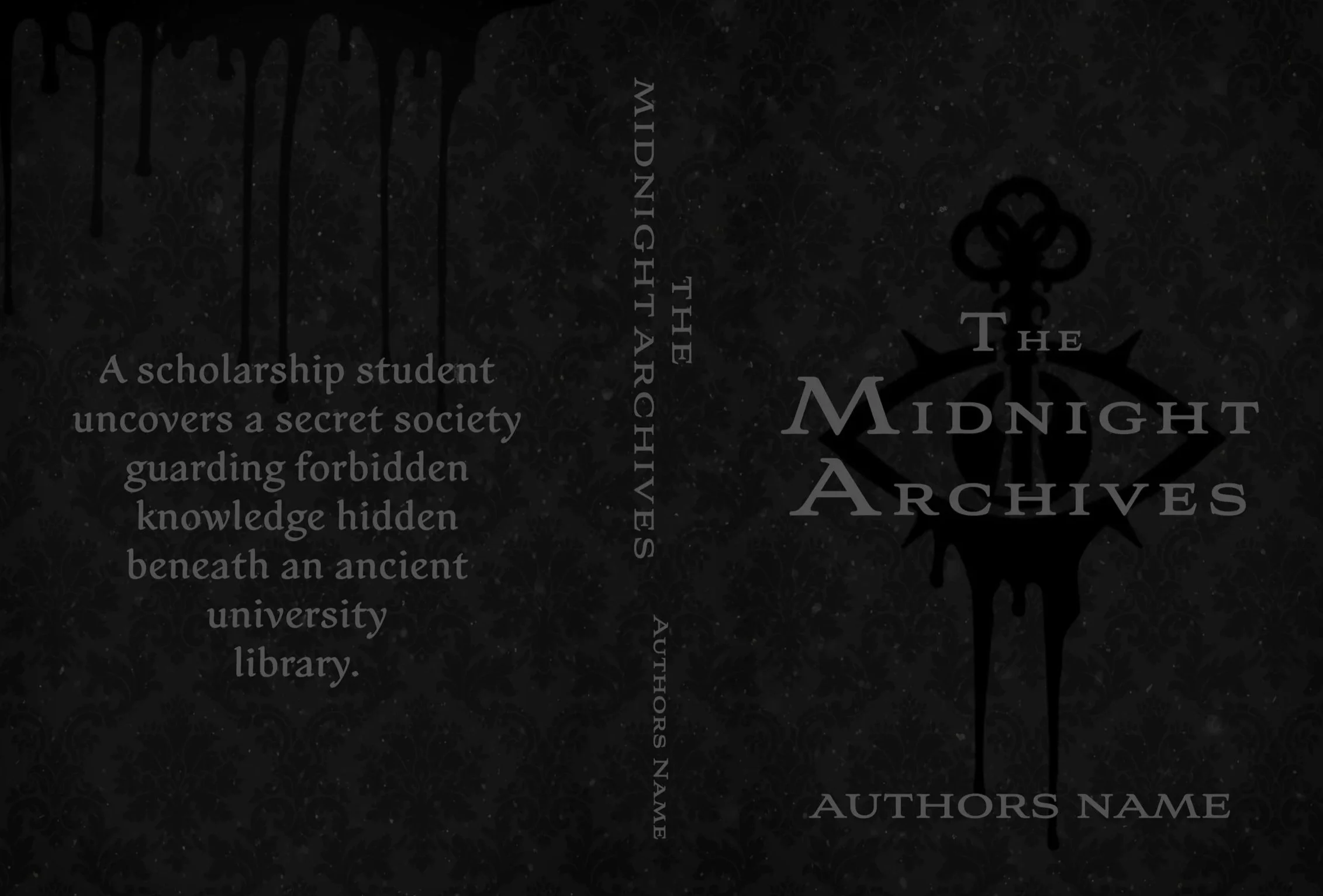
I imagined this almost as a photograph taken in a hallway within the secret society’s archives. There would be faded, ornate wallpaper with the secret society’s symbol on the wall.
Sure, that’s all very standard, but I also wanted it to feel almost forgotten or forbidden. That’s why I added the dust motes and blood dripping down from the bottom of the society’s symbol.
Concept 3
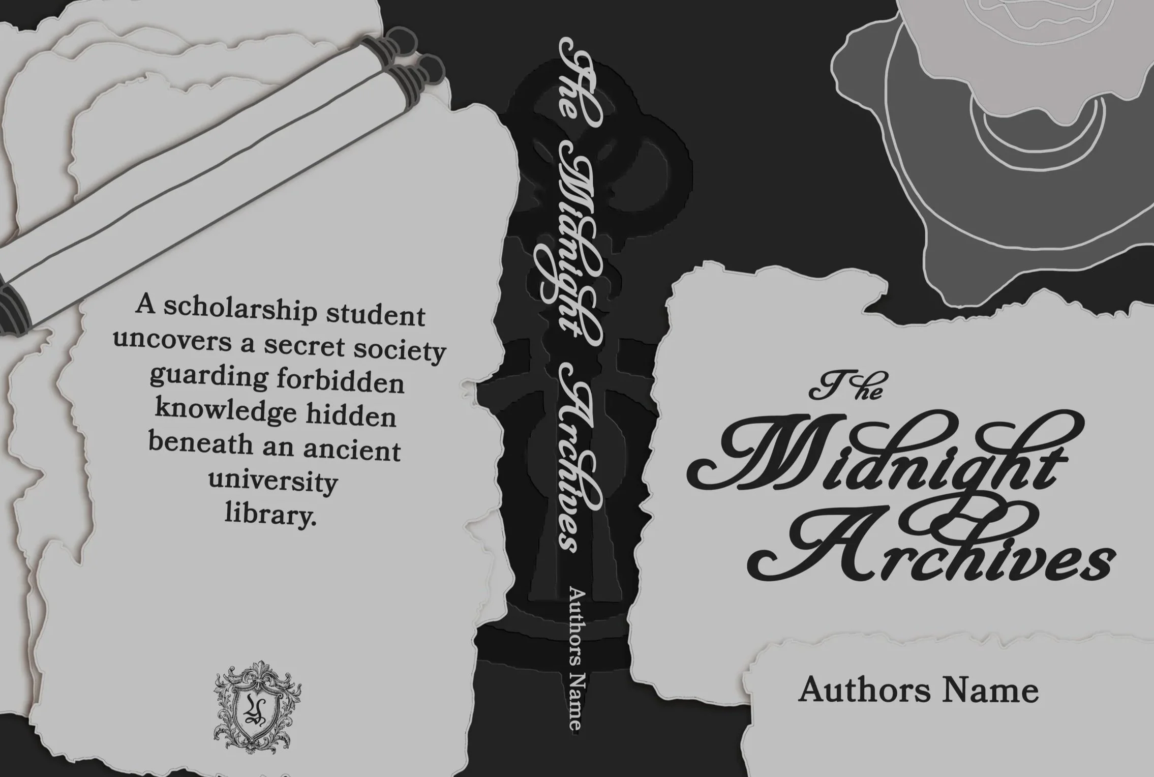
With this concept, I imagined a crowded workspace being used at night, as if someone were trying to uncover the truth about what the secret society is keeping hidden.
A wooden table engraved with the secret society’s symbol would be partially covered with parchments and scrolls, with the secrets being hidden among them. The only source of light would be a candle, almost as if it were shedding light on those secrets.
Choosing the Final Concept
In the end, I chose Concept 1, as I kept being drawn back to it. I found the idea of a book from the actual archives to be a freaking awesome idea.
Instead of designing something that showcases the world of the story, I find the idea of designing something that feels like it belongs in that story, brought into our world, far more interesting and fitting. It feels like you are part of that world, not just a viewer.
Leather-bound tomes always have an elegant, luxurious feel about them but also a sense of mystery, as not many of them have covers that show what the book may be about. Just the title and some decorative edging. It makes you wonder what may be inside.
Bringing the Cover to Life
Thanks to the visual references and images I collected for the mood boards, putting the final cover together went quicker than if I had to search for the assets as well.
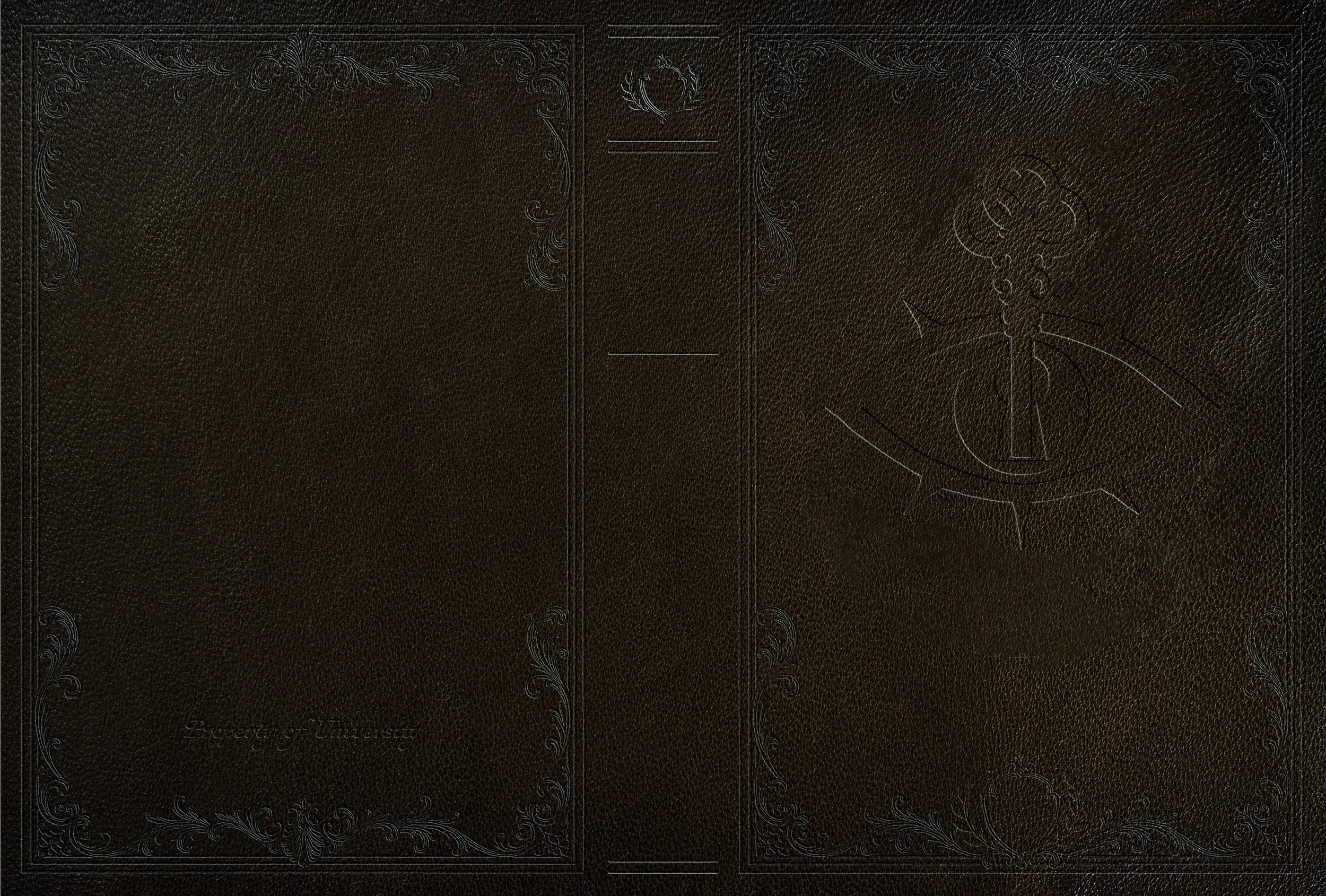
The process was fairly straightforward. I first created the debossed effect on the leather texture for the ornate borders and the secret society symbol. After that, it was really just a matter of layering the gold foil onto the front and back borders and spine, adding the old, worn note taped to the back, placing the text and finally making some last colour corrections.
The debossed effect took a bit of fiddling, as I couldn’t quite get the sizing right for the texture filter I was using at first.
For the title font, I initially chose a font called Darka. It’s a beautiful gothic font; however, while the title wasn’t necessarily difficult to read, it wasn’t having the effect I was going for. So I changed it to a font called IM FELL English PRO, which was easier to read while still having an elegant sort of feel with its small flourishes.
Something similar happened with the secondary font. I initially chose Antiquarian Scribe; however, it didn’t fit the overall aesthetic I was aiming for, so I changed it to Cormorant Garamond.
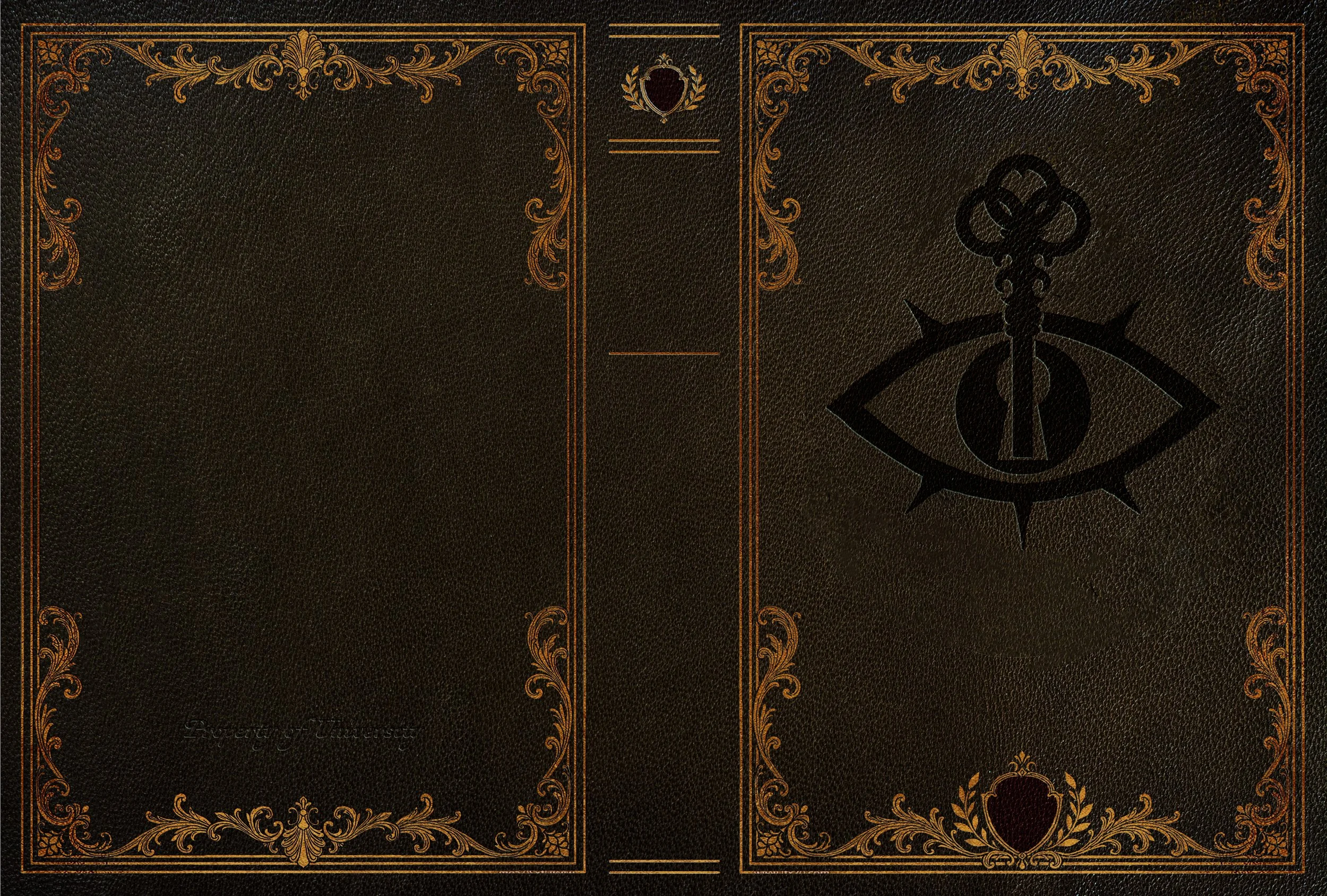
The secret society symbol is an eye with a key standing upright out of a keyhole shape in the pupil. It’s meant to symbolise secret knowledge that only a select few can gain, or something to that similar effect.
I placed it front and centre on the front cover, underneath the title, in the hope that the rest of the book would feel like it was designed around that central motif. This also emphasises the importance of the secret society.
Since I imagined it as part of a collection within the secret society’s archives, other books in that collection would have the same design on them too. The books within the collection would blend into one another, becoming indistinguishable from each other and hiding their secrets unless you know what you are looking for.
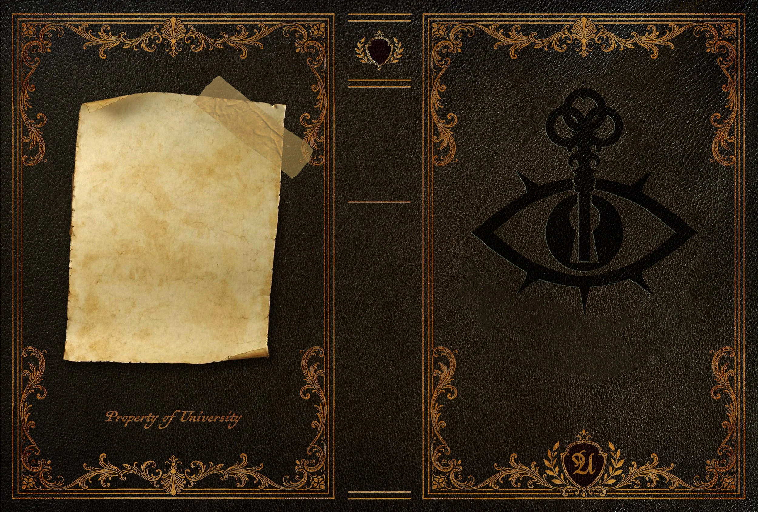
I placed an old, worn note taped to the back because I wanted the design to feel like someone had taken this particular tome from the archives without the secret society’s permission, so the reader could know the truth.
Leather books in general are precious, and I’d hate to ruin one by stapling something to it, so that’s why I chose tape. Plus, if the note were stapled, it could potentially damage the information inside the book. Whoever pilfered the tome from the archives wants the knowledge contained within to be known by others, so they wouldn’t dare damage it.
The note is there as space for the story blurb.
Final Outcome
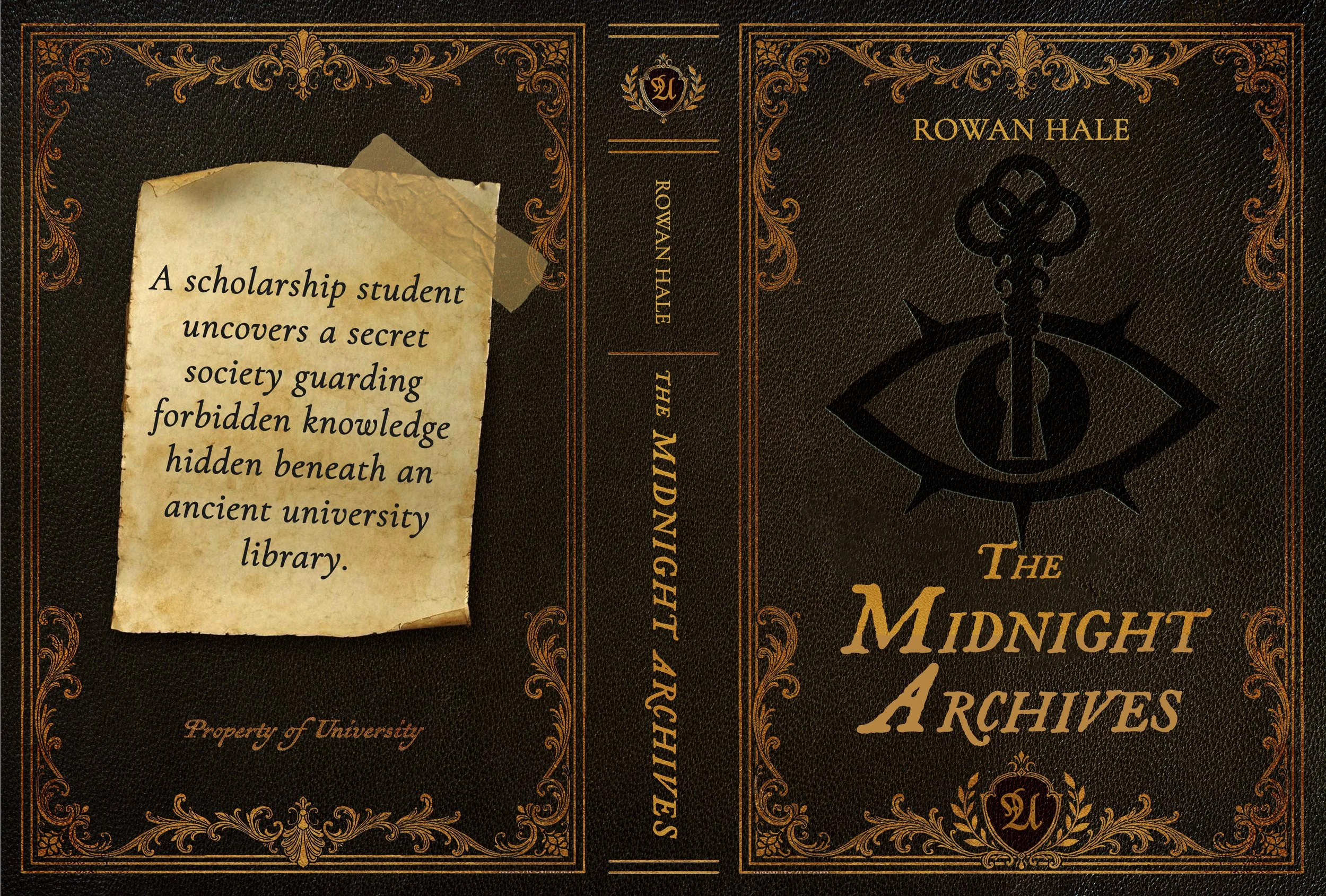
The final full cover feels like an old and slightly tarnished academic tome belonging to an ancient secret society archive. From the slightly dulled gold foiling and debossed detailing to the note taped on the back, it feels exclusive, mysterious, and like something that has traversed worlds to be in our hands.
Reflection
In the end, the final full cover turned out to be just amazing. While I had some trouble hunting down worn-looking textures, I feel like I did a pretty damn good job of making it look old. I would’ve liked it to look even more worn down, but I’m still very happy with it as it is.
The debossed leather texture and gold foiling make me want it to be real, as in a real debossed leather-bound book. Plus the mysterious note on the back! It’s just triggering that creative fantasy nerd in me.
I suppose what I found most difficult was coming up with two other concept ideas. I came up with Concept 1 almost immediately, and when I have an idea that I love, it’s kind of hard for me to think of other ideas. Coming up with two extra concepts was a good exercise for me, though, as it made me think of other possibilities and gave me options.
I was also stuck for a little while on which concept to choose because I did like them all. I was stuck between what would be the most marketable and what I felt best encapsulated the story. In the end, as you know, I chose Concept 1, which I feel suited the story, and I really wanted to make it.
With each project I make, I learn more about typography, surprisingly. Especially the difference between visual appearance and readability. Finding the right one that ticks both boxes for me can be a struggle, so sometimes I do have to make a choice between aesthetics and readability. Readability is always important, so that always takes precedence.
This was also the first time I designed a cover that looks like an actual object from the story, rather than designing around an object from the story or around an illustration. I genuinely enjoy bringing ideas and objects from stories to life this way.
I’m overall very happy with the finished project, and I hope you like it too.