
Saltwater Hearts
Client: Personal Project
Month/Year: July, 2026
Industry: Publishing & Literature
Project Overview
Saltwater Hearts began with a feeling.
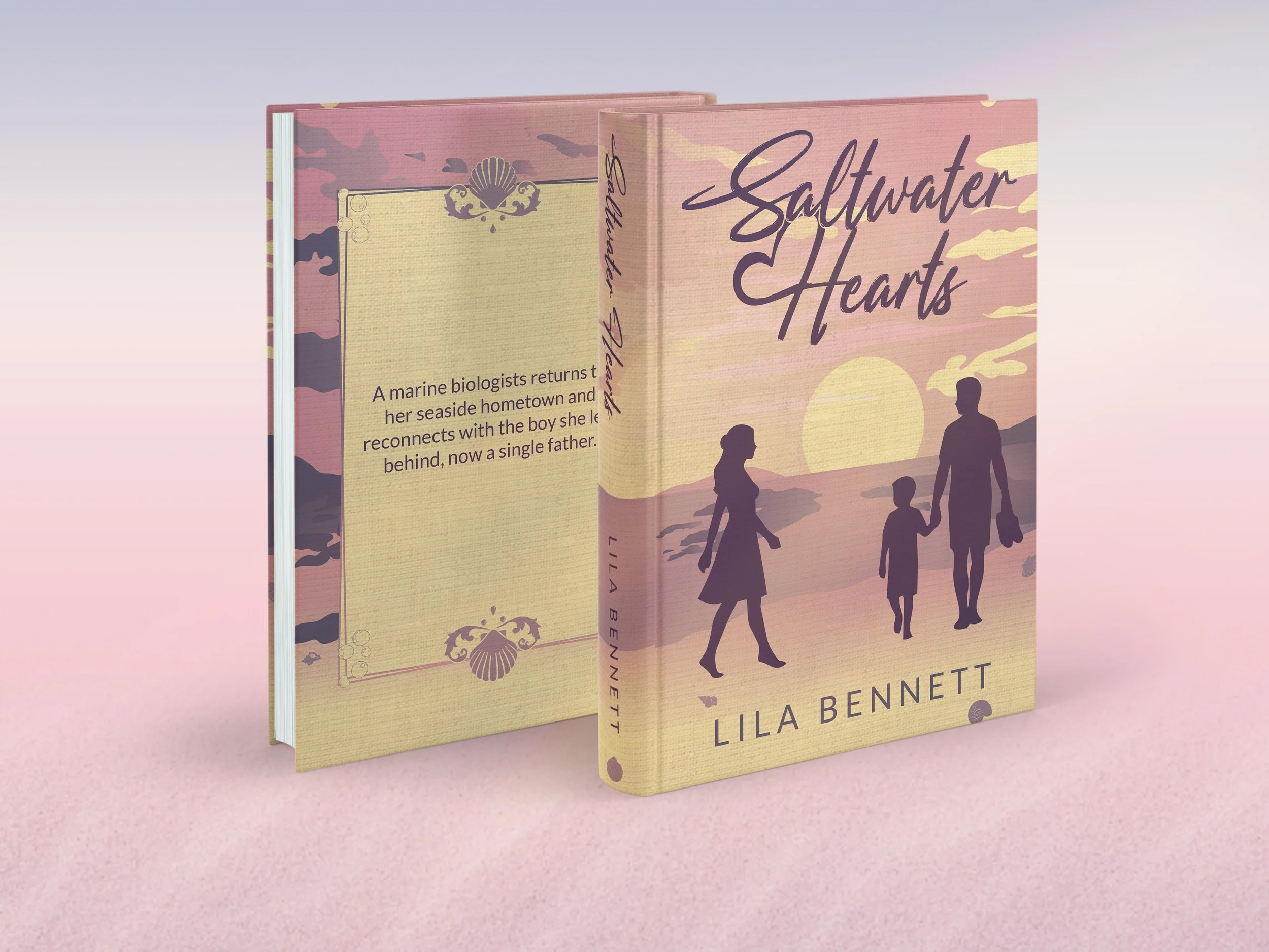
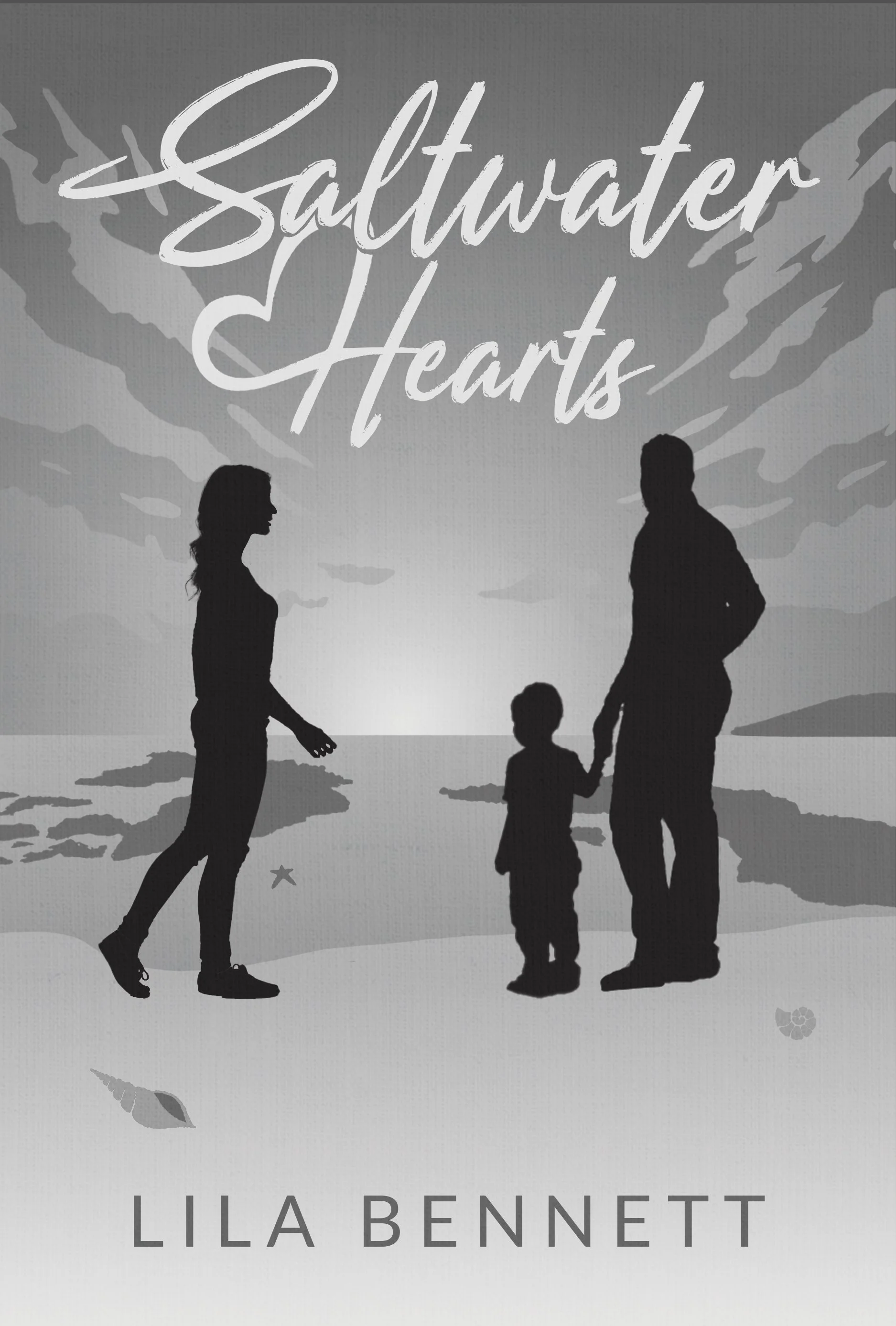
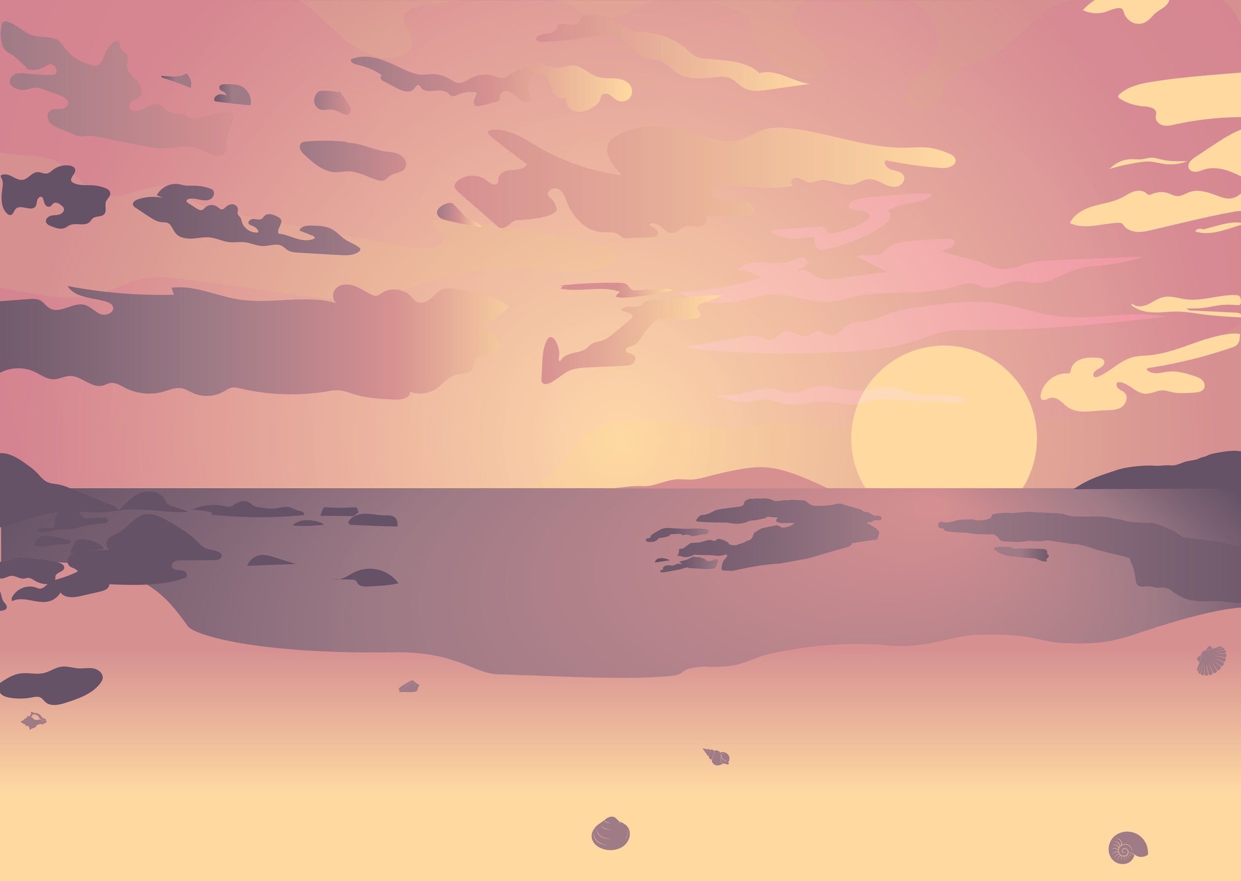
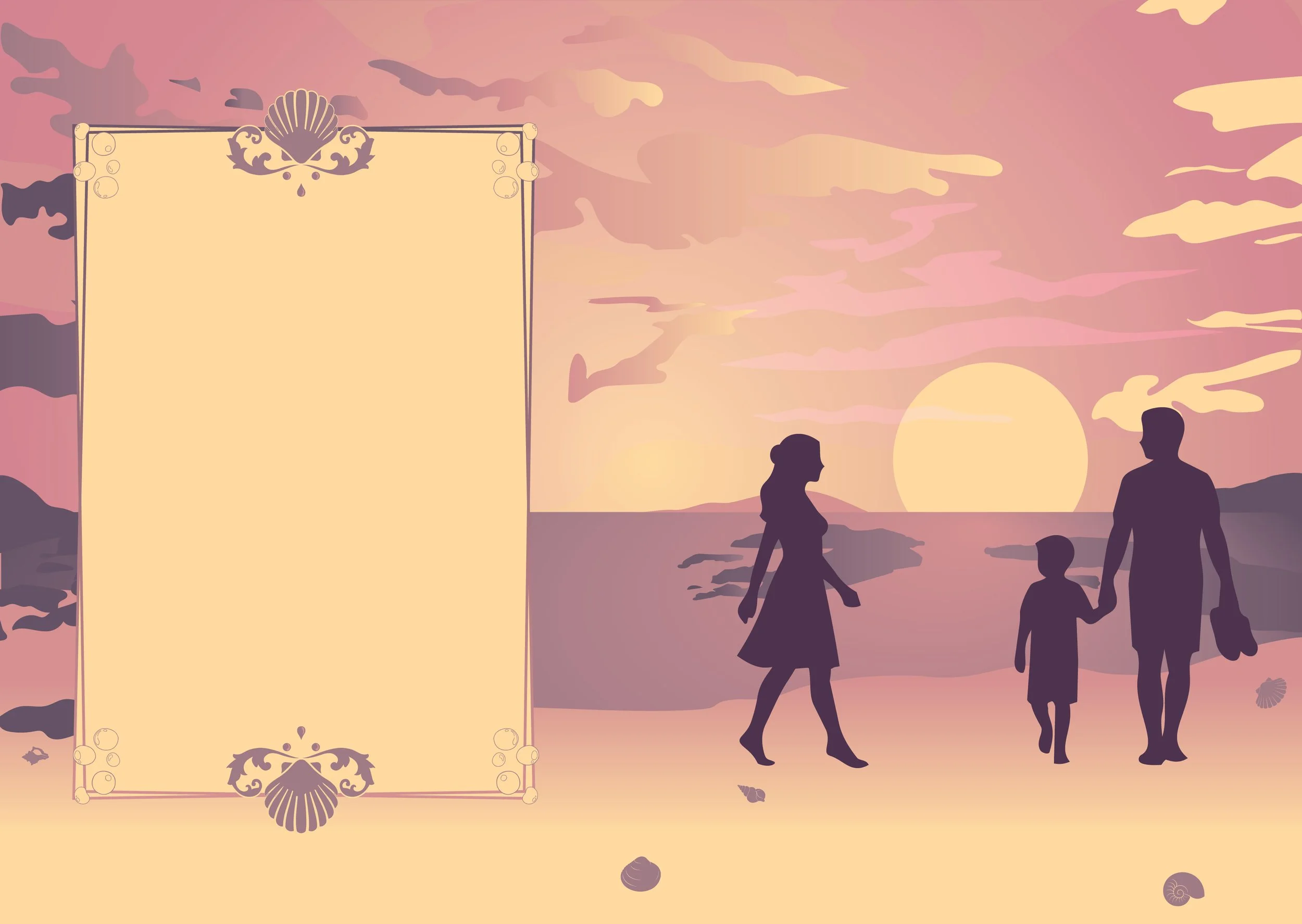
The moment I read the brief, my mind immediately painted the same picture: a pastel sunset, the ocean in the distance, and three figures standing together at the water’s edge. It was one of those rare moments where the idea arrived almost fully formed before I’d even opened Photoshop.
The story follows a marine biologist returning to her seaside hometown after many years away, only to reconnect with the boy she left behind - now a single father. It is a story about second chances, familiar places, and discovering that home isn’t always a place. Sometimes, it’s a person.
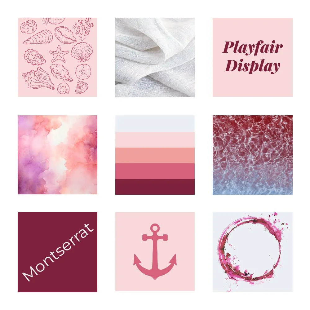
Inspired by coastal sunsets, handwritten notes, and the quiet comfort of summer evenings, Saltwater Hearts explores themes of love, longing, hope, and belonging. The brief called for a soft, airy aesthetic featuring pastel colours, handwritten typography, and subtle textures inspired by sand, water, and linen - all elements that felt perfectly at home beside the ocean.
Unlike many of my other projects, which tend to wander into magical forests and ember-lit kingdoms, Saltwater Hearts remains firmly grounded in the real world. And perhaps that’s what makes it feel so special.
Design Process
Returning to the Shore
Although I had a strong feeling about the final direction from the beginning, I still wanted to approach the project as though I were presenting concepts to a client.
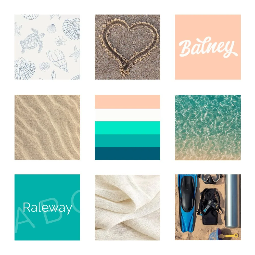
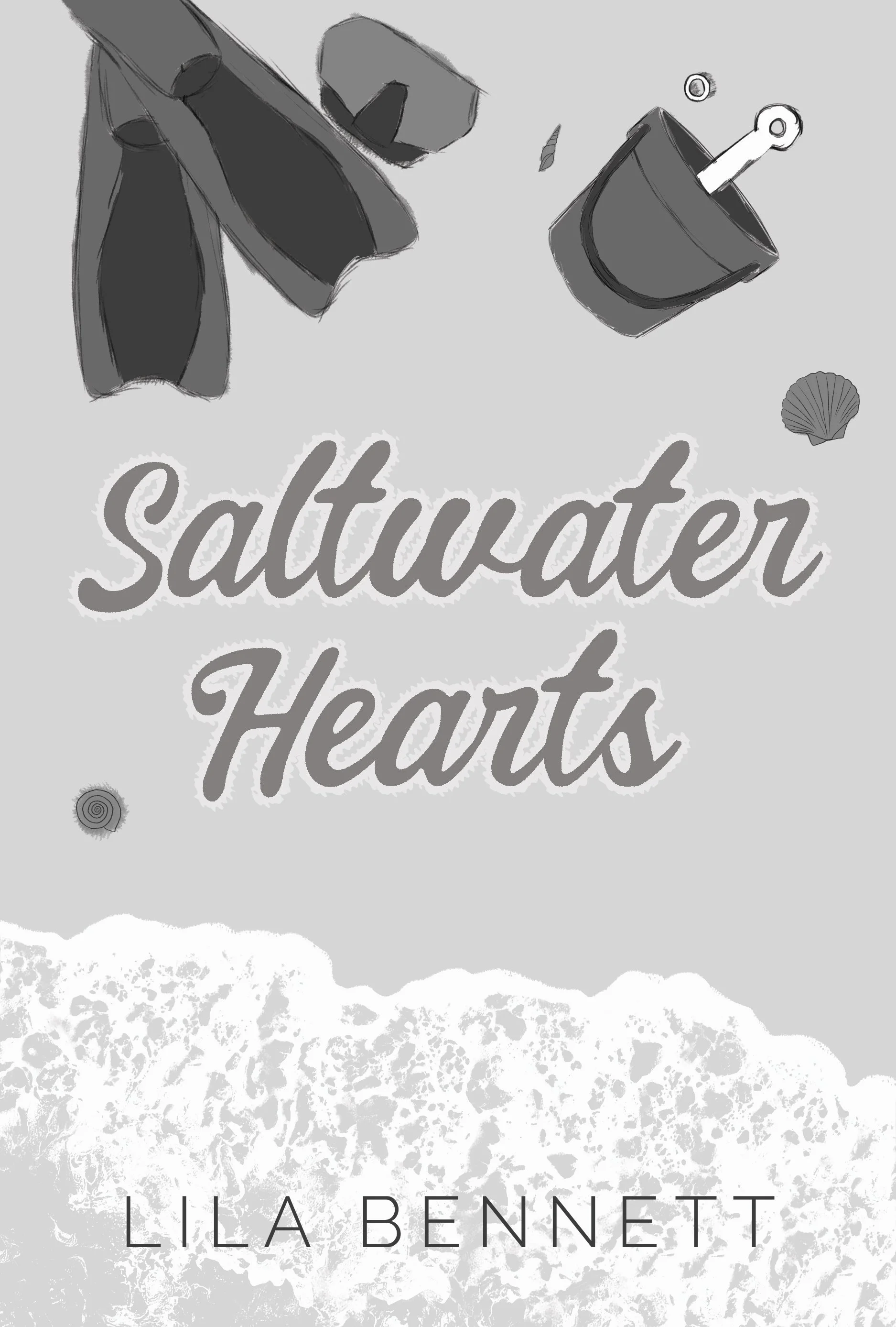
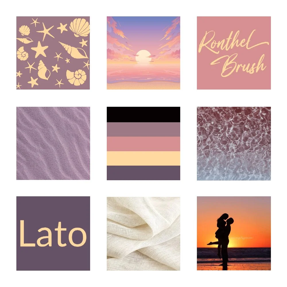
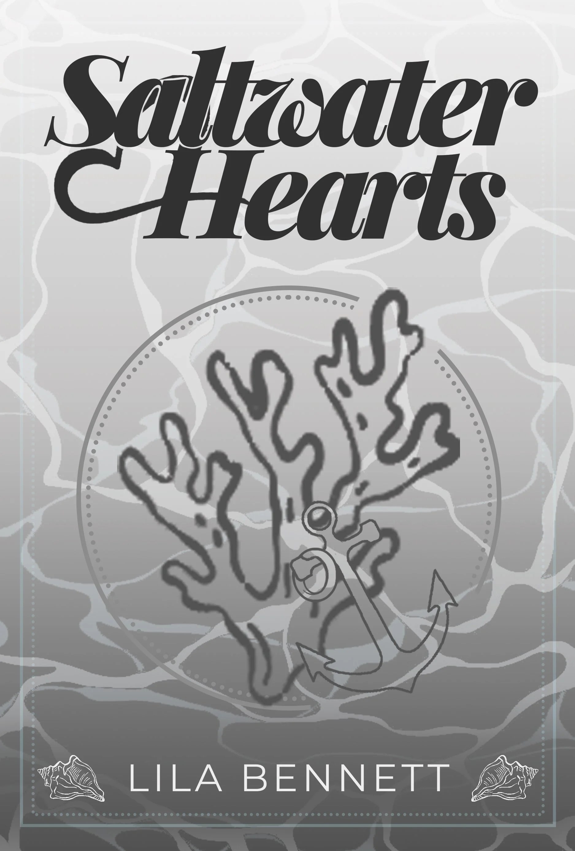
After researching contemporary romance covers, I developed three distinct concepts: a photographic collage inspired by symbolic objects from the story, an iconographic concept built around coastal motifs, and an illustrated concept featuring silhouetted figures standing beneath a setting sun.
Each approach had its strengths, but no matter how many ideas I explored, my thoughts kept drifting back to the shoreline.
The photographic concept hinted at the story through objects - a wedding ring, diving equipment, and a child’s bucket - but it felt a little distant. The iconographic concept was elegant, but lacked the emotional warmth I was searching for. The illustrated concept, however, immediately felt like the story I had imagined on that first day.
Chasing the Feeling
While working on the cover, I wasn’t consciously thinking about symbolism or visual hierarchy. Instead, I found myself thinking about the protagonist.
I imagined what it might feel like to return home after years away - to stand on a familiar beach and wonder whether the person you once loved had ever truly let you go.
There was a sense of longing in that thought, but also hope. And perhaps a little hesitation.
Those feelings became the foundation of the final design.
The silhouettes allowed me to focus on the relationships rather than appearances, inviting readers to project themselves into the story. Combined with a pastel sunset palette, handwritten typography, and soft linen textures, the final cover aims to feel warm, nostalgic, and quietly romantic.
A Different Kind of Storytelling
Much of my work is rooted in fantasy and imagination, so stepping into the contemporary romance genre was both exciting and unfamiliar.
There are no ancient ruins in Saltwater Hearts. No magical artifacts. No kingdoms waiting to be saved.
Instead, there is a beach, a sunset, and three people standing together at the edge of the water.
Sometimes, that’s enough.

Final Outcome
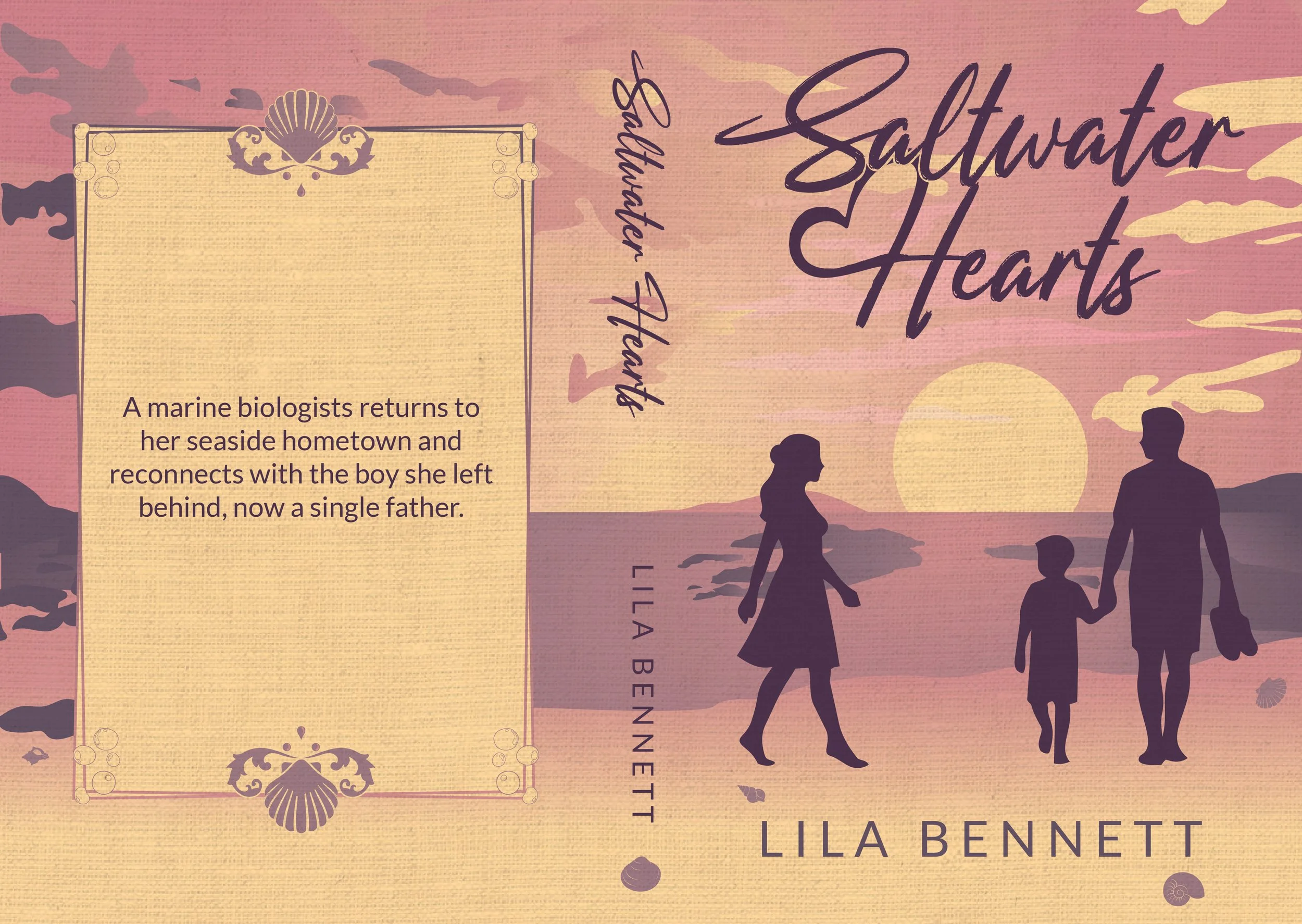
The final cover combines silhouette illustration, soft pastel colours, and subtle textures to create a contemporary romance cover that feels gentle, inviting, and emotionally driven.
From the setting sun to the handwritten title, every element was chosen to support the feeling at the heart of the story: the possibility of a second chance.
The completed wraparound design captures a quiet moment suspended in time - a moment where the past and present briefly stand side by side, and where the future remains unwritten.
Looking back, I think what I love most about Saltwater Hearts is its simplicity. It doesn’t ask the viewer to solve a mystery or decipher hidden meanings. Instead, it simply invites them to pause for a moment and wonder:
“What happened between these people”
And, hopefully, to turn the page to find out.
Reflection
This project reminded me that design doesn’t always have to be loud to be memorable.
I often find myself drawn to stories filled with magic, mythology, and elaborate worldbuilding, so creating something so grounded felt strangely refreshing. It was a reminder that storytelling exists everywhere - in grand adventure, yes, but also in quiet conversations, familiar places, and the people who leave footprints on our lives.
It also reinforced something I’ve slowly been learning as a designer: sometimes my first instinct is worth listening to.
The illustrated concept was the very first idea I had when I read the brief. Even after exploring different directions, I kept returning to the same image of a seaside sunset and three figures standing together on the shore. In the end, perhaps the cover had already decided what it wanted to be long before I did.
More than anything, I wanted Saltwater Hearts to feel like the happiness, comfort, and safety you experience when embraced by someone you love.
And if even one person looks at this cover and feels a little warmth in their chest, I think it has done its job.