
Ink & Embers Studio
Client: Personal Project
Month/Year: June, 2026
Industry: Publishing & Literature
Project Overview
Ink & Embers is a fictional boutique publishing studio dedicated to helping indie fiction authors bring their stories to life through professional publishing support and creative guidance.
The goal of this project was to create a visual identity that balanced creativity and professionalism. The brand needed to feel warm, imaginative, and welcoming while maintaining the trust and credibility expected from a publishing service. The final identity was designed to appeal to indie fictional authors seeking creative support without leaning too heavily into whimsical or fantasy-inspired aesthetics.
The Brief
The brief stated the brand’s visual direction should balance handcrafted with editorial professionalism. It also specified a colour palette of charcoal, burnt orange and cream, alongside inspiration drawn from well-loved books, ink on paper, glowing embers, creative studios, storytelling, and the publishing journey.
Together, these references suggested a brand that should feel creative and welcoming without sacrificing trust and professionalism - an important balance for a publishing studio working with independent authors.
Brand Direction
One of the biggest challenges during the early stages of the project was balancing my perception of what a professional brand should look like with the creative atmosphere described in the brief. Initially, I attempted to explore more contemporary approaches, but they felt disconnected from the warmth and imagination I wanted the brand to communicate.
Instead, I found myself repeatedly drawn to Victorian-era printing and publishing aesthetics. Traditional printing presses, ornate signage, and handcrafted typography reflected the themes of storytelling, literary craftsmanship, and creation that sat at the heart of the project.
This direction also offered a way to introduce a sense of magic and wonder without becoming overly whimsical or childish, helping the brand feel both imaginative and professional.
Visual Exploration
Rather than searching for a direction from scratch, I already had a strong sense of the atmosphere I wanted the brand to capture. The exploration phase focused on gathering imagery, typography, textures, and visual references that aligned with that feeling.
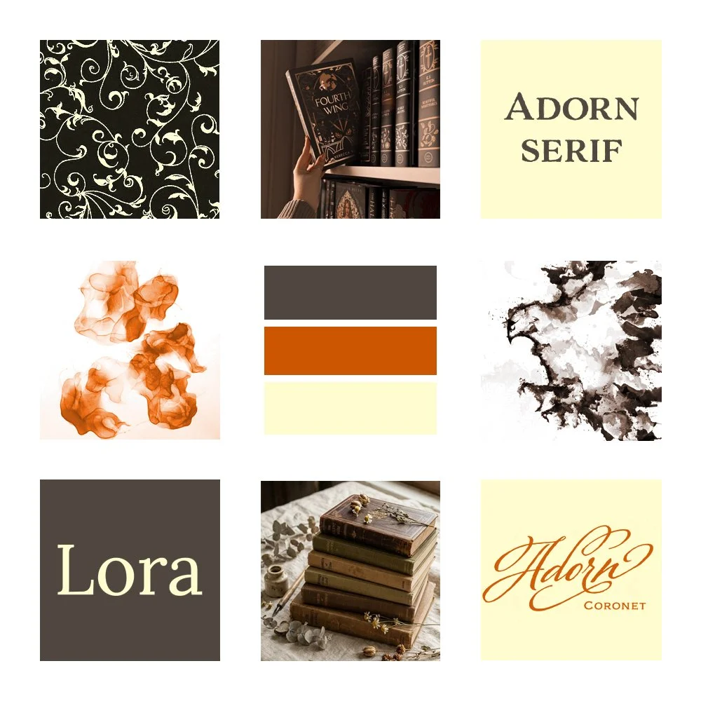
The moodboard drew inspiration from historic publishing materials, decorative typography, aged paper, ink, and dark academia-inspired interiors. As these references came together, recurring themes of literary craftsmanship, warmth, creativity and storytelling began to emerge.
This stage helped confirm that the Victorian-inspired direction aligned with both the project’s goals and the emotional tone described in the brief.
Identity Development

Typography
I settled on ‘Adorn Serif’ as the primary display typeface for its historic character and subtle imperfections, which evoke traditional printing methods and handcrafted books. It was paired with ‘Adorn Coronet’ as an elegant accent font, and ‘Lora’ for body text, creating a balance between personality and readability.
Colour Palette
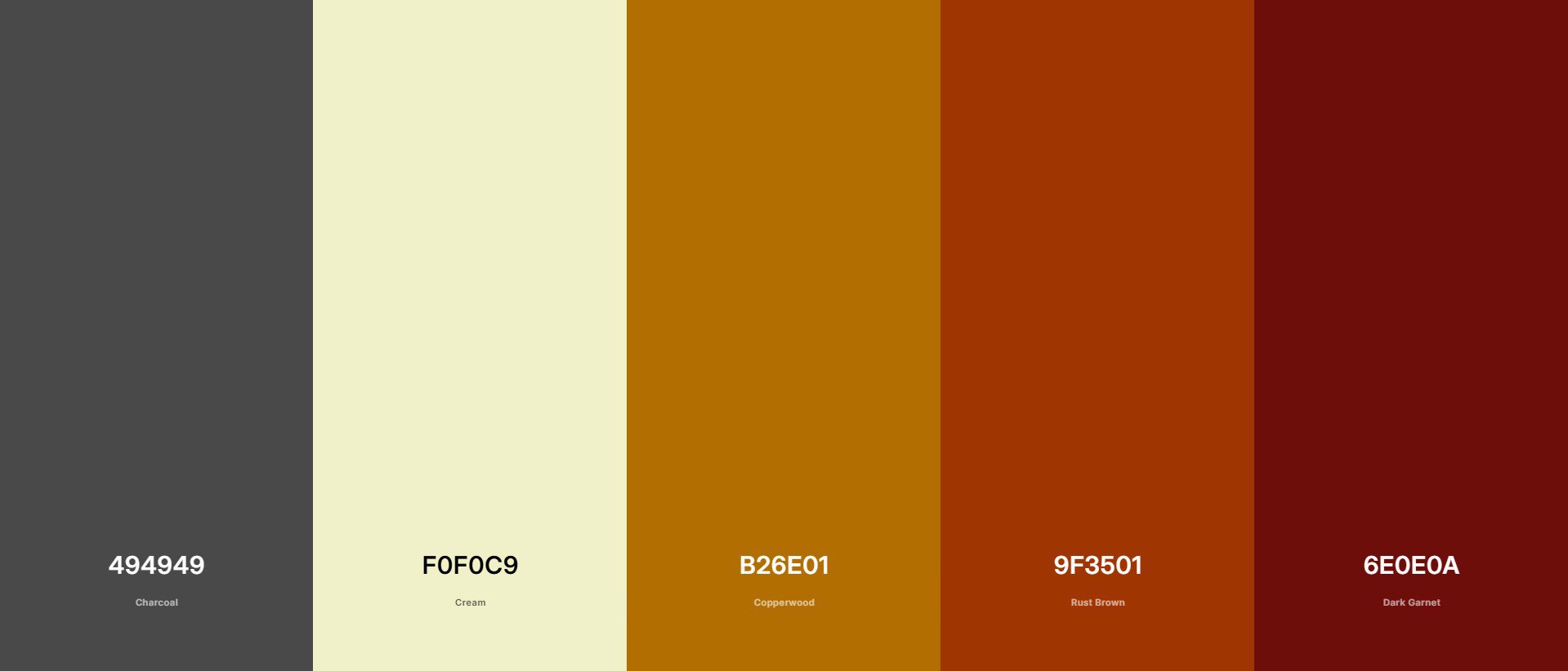
During the logo development process, it became clear that the original colour palette lacked sufficient contrast and wasn’t supporting the wordmark as effectively as intended. The palette was refined to include charcoal, cream, copperwood, rust brown and dark garnet, creating a warmer and more flexible system while improving accessibility and visual impact.
Supporting Elements


The supporting elements and ornamentation were one of the hardest aspects to establish. The decorative flourishes were a no-brainer, as they reinforce the elegance and professionalism, with a hint of whimsy. My mind also kept returning to a compass-inspired motif, because I see the compass as a symbol of storytelling, discovery, and guidance. Together, these elements help reflect the studio’s role in helping authors navigate the publishing journey.
The Final Identity System
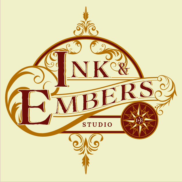
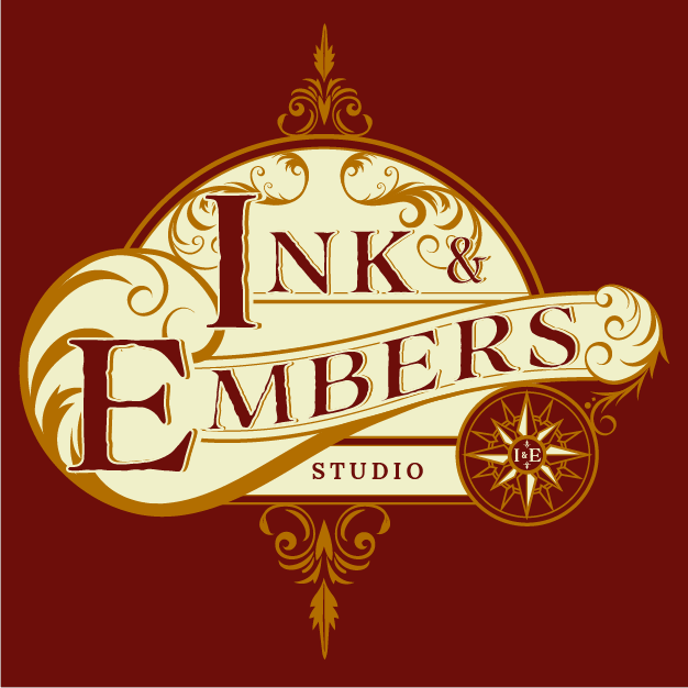
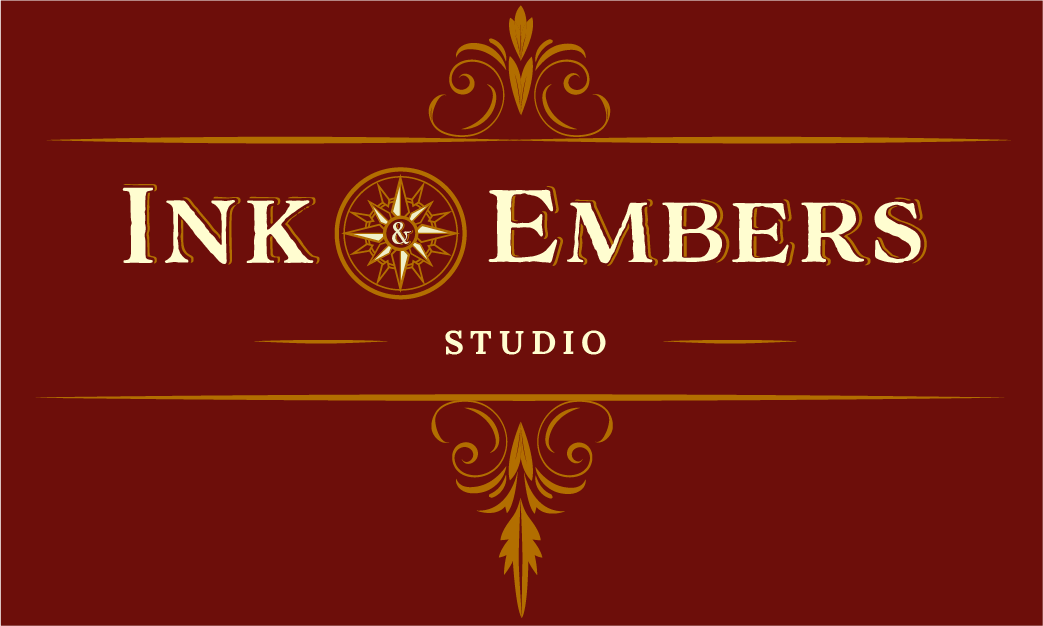
The final identity system includes a primary logo, secondary logo, and a set of supporting submarks designed to provide flexibility across different applications. While each mark serves a different purpose, they all share the same Victorian-inspired character, decorative flourishes, and warm colour palette, creating a cohesive and recognisable brand.
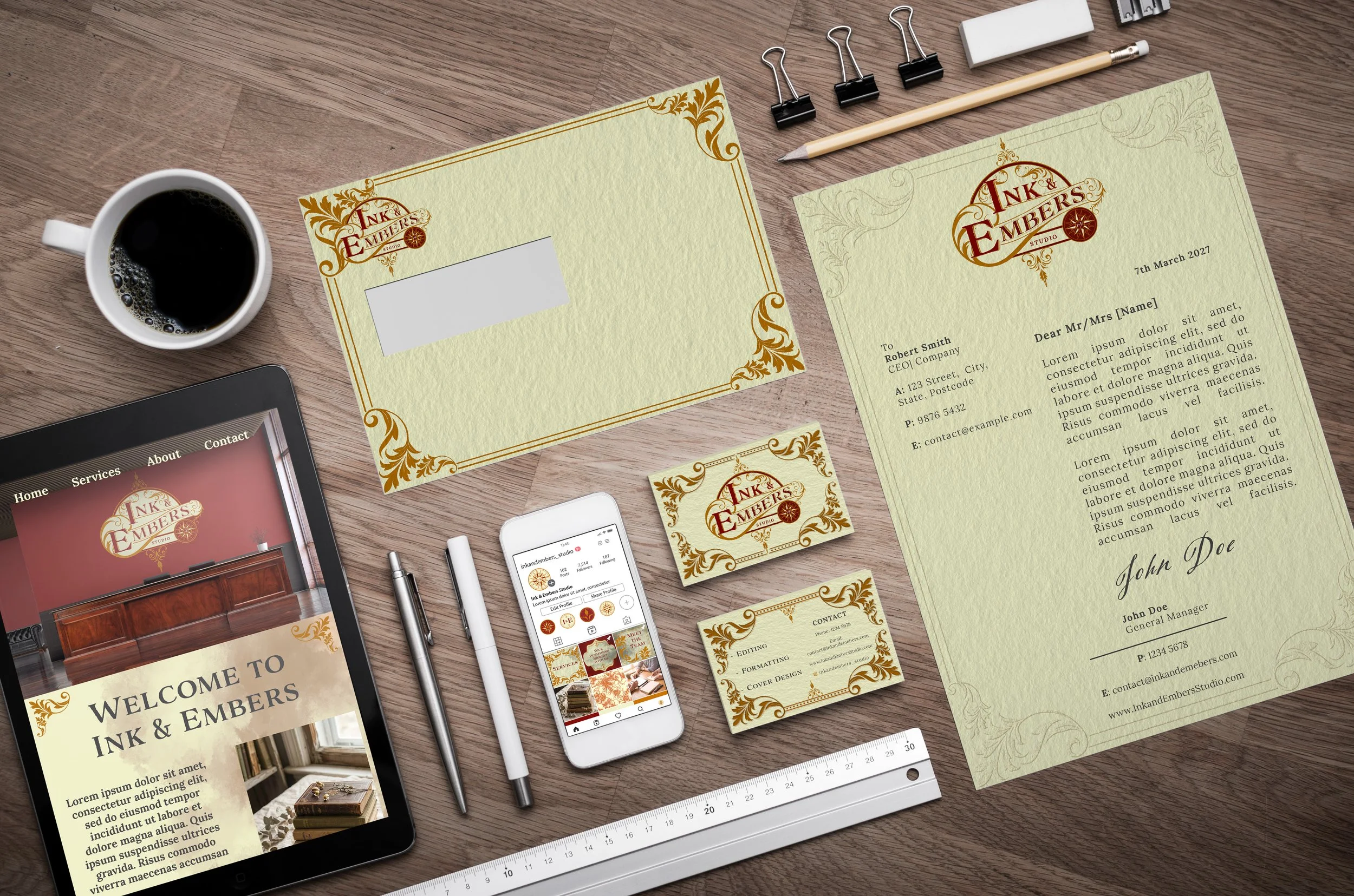
To demonstrate how the identity functions in practice, the branding was applied across a range of touchpoints, including stationery, business cards, social media, and website concepts. These applications show how the visual system remains consistent while adapting to both print and digital formats, helping Ink & Embers present a professional, welcoming, and memorable presence across every interaction.
Main Logo
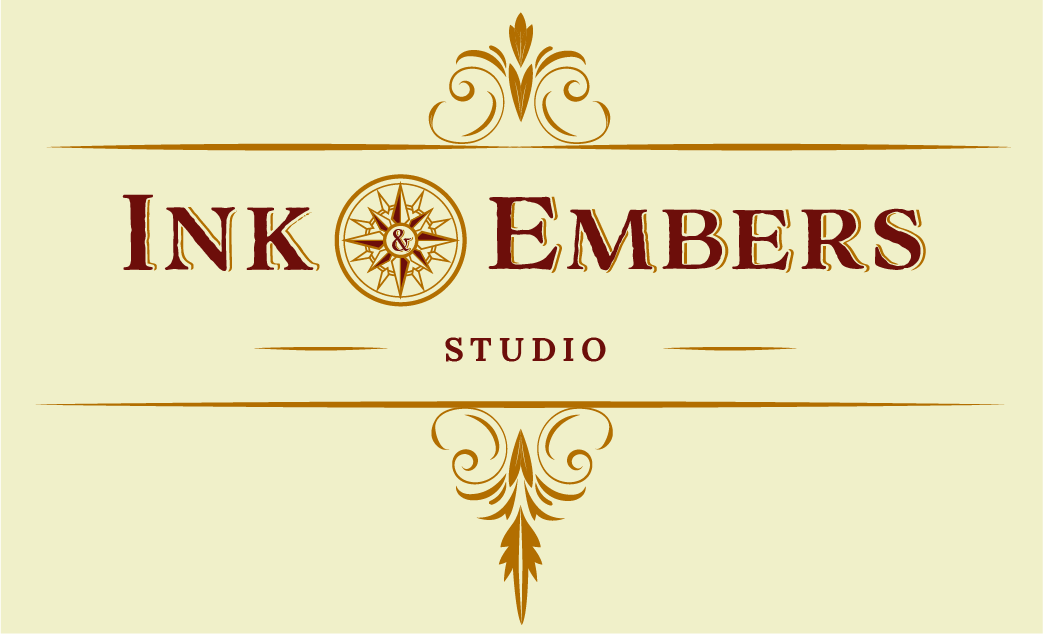
Secondary Logo

Submarks



Reflection
This project pushed me outside of my comfort zone more than I expected. One of the biggest challenges wasn’t designing the identity itself, but trusting a direction that felt right instead of trying to force the brand into what I thought was expected. Looking back, committing to the Victorian-inspired approach became the turning point that allowed the rest of the identity to develop more naturally.
It also reminded me that creative projects don’t always follow a neat process. Sometimes the strongest ideas are the ones you keep coming back to, even when you initially doubt them.